Styling Elements
Learn how to style elements using Yumma CSS.
Applying utility classes
Apply utility classes to your HTML elements to style them. You can apply multiple classes to a single element.
<button class="bg-indigo rad-1 b-0 tc-white c-p fw-600 py-1 px-5 h:bg-indigo-8">Subscribe</button>Here’s a quick reference for the examples above.
| Class | Style |
|---|---|
bg-* | background-color |
rad-* | border-radius |
b-* | border-width |
tc-* | color |
c-* | cursor |
fw-* | font-weight |
h:* | hover: |
px-* | padding-x — (left & right) |
py-* | padding-y — (bottom & top) |
Combining utility classes
You can combine utility classes to create complex styles.
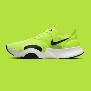
Sneakers
Comfortable and stylish, these sneakers are perfect for any occasion.
<div class="bg-white bs-lg d-f fd-c g-4 h-100 max-w-80 p-5">  <div class="p-r">    <span class="bg-black fs-xs fw-700 l-2 p-a px-2 py-px rad-9 t-2 tc-white us-none">New</span>    <img class="h-40 of-c w-full" src="/img/shoes.jpg" />  </div>
  <h3 class="fs-md fw-600 tc-black">Sneakers</h3>
  <p class="fs-sm tc-slate">Comfortable and stylish, these sneakers are perfect for any occasion.</p>
  <div class="ai-c d-f jc-sb mt-auto">    <span class="fs-lg fw-700 tc-black">$59.99</span>    <button class="bg-black f:oc-black f:oo-2 f:os-s f:ow-2 fw-500 px-4 py-2 tc-white">Add to Cart</button>  </div></div>
Here’s a quick reference for the examples above.
| Class | Style |
|---|---|
rad-* | border-radius |
bs-* | box-shadow |
d-* | display |
fd-* | flex-direction |
f:* | focus: |
fs-* | font-size |
fw-* | font-weight |
g-* | gap |
h-* | height |
l-* | left |
mt-* | margin-top |
max-w-* | max-width |
of-* | object-fit |
oo-* | outline-offset |
os-* | outline-style |
ow-* | outline-width |
o-* | overflow |
px-* | padding-x — (left & right) |
py-* | padding-y — (top & bottom) |
p-* | padding |
p-* | position |
tc-* | text-color |
t-* | top |
w-* | width |
Why not vanilla CSS?
If you’re still not convinced about utility classes, here are a few reasons why you might want to consider them.
- No reusability - inline styles can’t be reused across components
- No consistency - inline styles make it hard to maintain a consistent design system
- No organization - inline styles can quickly become a mess
- No theming - inline styles make it hard to switch between different themes
With Yumma CSS every utility class will feel familiar to you since it’s pretty much just an abbreviated version of the property it represents. For example, d-f is for display: flex;, o-auto is for overflow: auto;, and so on.
Why use utility classes?
Utility classes solve many of the problems that come with traditional CSS approaches, especially when working on larger projects. Here’s why they make such a difference.
If your building projects with vanilla CSS chances are you’re probably familiar with some of the issues below.
- Invalid and outdated syntax - deprecated properties, old vendor prefixes, browser hacks
- Redundant styles - duplicate rules, specificity wars, unused selectors
- Refactoring risks - cleanup efforts, refactoring difficulties, global scope issues
- Naming conventions - inconsistent class names across different developers and time periods
- Performance issues - big bundle sizes, bloated CSS files, visual regressions
Utility classes solve these problems by taking a completely different approach to styling.
- Predictable and consistent - each utility does one thing reliably
- Composable and flexible - combine utilities to create complex styles
- Faster development - no context switching, immediate feedback, reusable patterns
One of the biggest time-savers with utility classes is that you don’t have to come up with names for everything. Instead of spending time thinking about whether to call something .card-header, .product-title, or .section-heading, you just use the utilities you need.